Friday, December 28, 2012

EMERALD...Pantone Color of the Year 2013


Emerald conjers up visions of the gem for me..not only is it my birthstone but one of my all-time favorite colors!   (Green in general, that is!)  

"Pantone, the global authority on color and provider of professional color standards for the design industries, announced PANTONE® 17-5641 Emerald, a lively, radiant, lush green, as the Color of the Year for 2013." 


I personally also think of the environment...according to Leatrice Eiseman, executive director of the Pantone Color  Institute®,  “Green is the most abundant hue in nature – the human eye sees more green than any other color in the spectrum,” said Leatrice Eiseman, executive director of the Pantone Color Institute®. “

 "Most often associated with brilliant, precious gemstones, the perception of Emerald is sophisticated and luxurious. Since antiquity, this luminous, magnificent hue has been the color of beauty and new life in many cultures and religions. It’s also the color of growth, renewal and prosperity – no other color conveys regeneration more than green. For centuries, many countries have chosen green to represent healing and unity."

Besides the gem and environment, I think about the green marble used in upscale interiors of the past (and still used in some of the casinos/hotels out and about)...

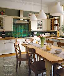
You are probably asking yourself, "how am I going to use it?"  I have included some inspiration...


Emerald will be popular in the fashion industry as well as clothing  and interior accessories.  Below are the chosen colors of the Spring 2013 Fashion Colors.


I hope to have inspired you to rethink your use of emerald green by showing some examples of its use.  You could find other inspirations just by googling "emerald green interiors"...
What do you think of with this color?  Where would you use emerald green in your own home?  How about wearing it?


*****Exerpts for this blog post are from http://www.pantone.com/pages/pantone/pantone.aspx?pg=21056&ca=10.


Monday, December 17, 2012

Amaryllis Center Piece

Beautiful centerpiece for a holiday table.
I promised a post about the beautiful amaryllis flower...and after reading how easy it is to grow  them you will want to do your own table scape such as the one shown...let's get started...

First off, the amaryllis or Hippeastrum, can be grown outdoors if the temperature doesn't go below 10 degrees or it can be forced to bloom indoors at the holidays.  Some people prefer to buy new bulbs each year and you can even buy them at Target. (****They are on sale this week there...) Although, the bulbs from our local flower shop have always produced larger and more flowers!

First time out, if your amaryllis comes pre-potted it just needs to be thoroughly watered with lukewarm water after you have bought it.  I water them thoroughly every week with a small amount of fertilizer added each month.  try not to soak the bulb.  Place in a sunny window and wait for the awesome blooms to come!

The second year actually begins after the flower is done blooming.  Continue watering, trimming the bloom stalks about 2" above the bulb after it wilts and trim leaves as they yellow.  When the leaves do not stand up anymore or you are wanting it to bloom for the holidays again, you will need to place the pot and leaves in a cool dark place for about 2 months.  (Mine go into my basement for these 2 months.)  About 8 weeks before the holidays or the end of October I bring them out of the basement.

Re-pot the bulb in clean well-drained potting soil.  Leave top 1/2 to 1/3 of bulb out of the soil-water thoroughly and add fertilizer about once a month again.  They prefer the south facing windows and 79-80 degrees.  Mine have always taken the 2 months to bloom.  This year I had new growth in a day after re-potting!

For more information, search "care of amaryllis".  There are a lot of varieties and beautiful colors.  I have included a photo with several colors   Give it a try and ENJOY!!!


Sunday, December 9, 2012

Christmas Decor for your front Steps

It is that time of year..time to decide what you want to change, add, or delete from your holiday decor...well I have been lusting after greenery arrangements from Grandin Road for a couple of years and decided to do one myself.  (And in the process save several hundred dollars- because I would need two of the arrangements, one for each side of the front door.)  So here goes...supplies needed: 
Various options for greenery and lighting.

  • .a vase or pot that you use for fresh, live flowers in the spring and summer.  (The great thing about this is that you don't have to take the pots back and forth to storage.  The one shown is from Target in the Smith and Hawken line.)

  • greenery, fresh or faux I have used both and prefer the live stuff, but we have alot of wind so the needles begin to drop before the season is over!

  • faux picks of pincones, bulbs, or what ever else you would like  (I have included some plastic lime green ornament balls in the container, but not the picture of the pieces used.)

  • lighted branches(mine are from Target) Lots of choices to pick from!

  • extension cord, unless you have a receptacle close by


  • timer rated for exterior use(again this from Target)  Love this because the timer fairy turns them on and off the same time each day!
There is 1 on each side of the door.


Tuesday, October 9, 2012

Montana Tile and Stone Summit 2012


Quarry Collection Petit Granit
Tile Backsplash
This past week, the Montana Tile and Stone Summit was held in conjunction with ASID(Interior Designers) and NKBA(National Kitchen and Bath) members.  It was held at the beautiful MTS store in Bozeman and allowed us to be surrounded by fixtures, tiles and stone.  It is THE most beautiful showroom of its kind!  (The awesome fixture showroom even has a working heated seat, bidet featured toilet from Toto.  Oh boy! The heated seat in the dead of winter here would be wonderful!)...definitely worth a try...  The tile department carries Italian tile, glass tiles, marbles, metals with even tiles with a 3-d type shapes such as a jumping fish...pretty cool!  They also have a production department where they can "build" your marble or granite counters with laser cutters, etc.


Statuario Marble Countertop and Tiled Wall
 

Why is the marble in the above photo called statuario marble?  Well, I believe it is because the old statues(like that of David by Michelangelo that was carved between 1500 & 1504.) 

You may have heard that marble is not appropriate in the kitchen-NOT TRUE!  If the David statue and other buildings were built out of marble have been around that long-why do we think it is not useful in the kitchen? You have probably heard that marble is too soft or stainable...well yes, it can stain, but if you are normally clean, neat person there shouldn't be any issues.  (For example, if a lemon or something acidic is spilled, yes, it can leave a mark, if not wiped up...if you spill tomato paste same thing,...but most of us wipe things up!)
If you look around in bakeries or restaurants, alot of them have marble as their countertops...and they have way more spills than we would at home...something to think about!
Boyce & Bean glass tile
 

Quarry Collection Caracas Blue Limestone Countertop
 and Golden Beach Limestone Floor Tile
 
A few samples of stone and tile shown there are featured in these photos! All photos are courtesy of The Quarry Collection website at quarryc.com They have other inspirational photos as well if you are interested.

So my question is: where could you use marble?
Calacata Marble backsplash from The Quarry Collection
 

Sunday, September 30, 2012

Neighborhood Housing + Junior League = Great Home Decor


I had the honor of helping Junior League of Great Falls and Neighborhood Housing with a decorator home for a qualified first-time homeowner-  a single woman and her grandson.  This home was built in an older neighborhood so they added extra trim at the windows, stylish doors and  cedar look shakes to the exterior, along with a cedar rail porch across the front-like so many other homes have in that neighborhood. 
 
 
EXTERIOR


We were given a budget of $2300 (a combination of JuniorLeague and Neighborhood Housing monies) to only be used for decor.  The homeowner had a bed for herself, her grandson, a newer sofa, and dining set.  The other information we had was that her favorite color was blue, preferred lighter color combinations, and she didn't like alot of clutter. 


Bedroom set donated by Feather Your Nest store


.


Pillows and Bedding for Master Bedroom
A bedroom set was donated by the generous owner of a new downtown store, Feather Your Nest.  The set included a king headboard, side table for the bed (both shown) and a long dresser with mirror.  Other donations included pillow forms for the 8 new pillows sewn, the fabric for the pillows, and some of the wall art. 

When I said "we", I meant Robin Madison and myself.  Robin, a new Junior League member, was relentless with searching out furniture, sending photos to the homeowner and myself, to get approval. She found some great prices and even contributed her own artistic talent for the artwork in the grandson's room. 


Storage and Artwork for grandson

Additional Items for grandsons room


Bathroom decor

Bathroom decor

The clear glass lamp in the living room(shown below) could hold objects-so what did we do, but put some of the shells inside.  (We also "plugged" the bottom of the lamp with a fabric covered board so that the homeowner could move it around.)  And/or she can change out the shells for a holiday-how about some ornaments for the Christmas season??? 

Livingroom Decor

Livingroom Seating & Ottoman


We did purchase some white faux wood blinds for all windows and a lace curtain for back door- and filled the bathroom with towels, a shower curtain, and rugs.  We created a "color story" by carrying a blue color throughout the home.  You can find bits and pieces of the blue in ALL of the rooms.  The human eye has less trouble moving from room to room by having this "color story" and it can make the entire space feel larger just by using similar colors throughout. 


Accent wall in livingroom
Even though the home was designed with large closet spaces, we tried to give the homeowner some added storage: her round leather ottoman opened up, 1 of the end tables had storage, the shelving and baskets on the accent wall and in the grandson's room.  Who can't use a spot or a place for everything?

This home shows that you can have a comfortable, stylish space using an economical budget!  Thank you to Kapri Byrne for the photos, the other League members who helped hang artwork, assemble furniture AND Thank you to Junior League of Great Falls and Neighborhood Housing for asking for my expertise!


Monday, September 17, 2012

Metallic Tree Stump Tables

Finished  END TABLE
So, what do you do if you have a pine tree to cut down?  Maybe the tree was dying from that darn pine beetle that has moved across our forests...or it is right in your own back yard...well, I begged(and pleaded) with my husband and his friend to cut me a couple of logs, at least 25" tall and about 30"circumference.  Amazingly he did- and I got 2 huge logs with which to create an end table or two.

BEFORE the transformation...
Here are the steps I used to create the end tables.  One will be a silver metallic log of "awesome-ness"(I am sure that is a word)- the other will have its bark stripped off, then given a clear top coat. 


Log to left is silver, log to right is clear coated
First off, is the log level?  If not, you can have a wonderful bonding experience with your husband and a chainsaw...Let's just say the "leveling" process was a little rustic...we used a marker, tape measure and a chain saw for the first leveling.    The table with the clear coat was sanded a little on the sides as well. (We used a belt sander to be faster and more productive.)  Next up, use a brush, blow dryer, or leaf blower to get the "dust" off and you are ready to paint or seal.  I used spray paint as it is easier to get into the crevices..and there were lots of crevices when the bark is left on.  I did spray the bottom first and let it dry for several days, then sprayed the sides and let them set for several days as well.  (We had discussed putting a small piece of rubber/foam or wood disc on the bottom to protect floors further, but ended up spraying the bottoms to prevent any kind of mold or other odd growths...) 

Total cost of project was 3 cans of spray paint: silver table was $21.84, the clear table was $11.61, with an additional cost of a 2 pk of sanding paper for the belt sander@ $5.97

I have included a couple of other examples of tree stump tables and my finished product.  Easy project with a big reward...HAPPY LOG HUNTING! 

P.S.  Of course, you don't have to start with such a big specimen...you could group several together...we tried to think of a way to make them a little lighter, but couldn't come up with a way to do that easily or without the logs splitting.
Photo credit to flickr.com
Photo credit to mydesignsecrets.com

Thursday, August 30, 2012

Choosing Color with ...

Choosing color with Donald Kaufman...

Paint Swatches

I came across an article in this months Elle Decor on choosing colors...food for thought for anyone planning to paint in their home..

If you have not heard of Donald Kaufman, it is no surprise unless you are into painting houses, interior design or something similar.  This man, along with his wife, is a nationally known color consultant.  He started his own company in 1976, and his best advice "is to use as few colors as possible."

Don Kaufman color

His rules are:

1. Use like intensities: don't put bright green in a room next to a gray-green.
2.  Look at your neighborhood for inspiration if you are considering paint for the exterior.
3.  Spend time looking at all of the elements in a space- furniture, windows, the color of the floor.
4.  Use complementary colors from a color wheel.  If you have a yellow kitchen, try blue for the dining room.
5.  Tone it down.  Find the color chip you think you want, then look for a quieter version, as it will look much brighter on the wall.
6.  Dark colors make a small room feel larger.  They make the walls recede.
7.  The cost is in the labor, not the paint.  So go for the gold in materials.
***Another tidbit from his article: warm neutrals are the safest choices , which is why they represent 90% of all paint sold.  Hmmm....do you want to be in the 90% or more unique?
 
Custom mixed paint color from Kaufman Paints


I use these rules daily when helping clients with choosing colors!  You should think about them as well!  And, if you need help doing this, I would be glad to help!  There are several ways to contact me- just do it! 


Sunday, August 19, 2012

2 Hour Headboard


Pottery Barn's Natural Linen Headboard

Two Hour Headboard


Finished Headboard


Do you have a spare 2 hours?  And about a $150 dollars? That's all it takes to build this beautiful, Pottery Barn-like headboard.....


Yes, sometimes it is easier to buy a piece of furniture...but in this case, it was just as easy to build it.  AND, you get to pick the exact fabric you want!!!  I have to confess that this is the 2nd HB we have built-the first was for the master bedroom and used a toile fabric.

What do you need: a saw ( a skill saw works great), a 2 x 4 piece of wood, a piece of plywood the width and heigth you want, poly batting, fabric to upholster with, an electric staple gun is nice, but a manual 1 is okay too, bolts to hook the HB to the bed. 

If you are not sure of the size, just check out a website that sells headboards; consider the size of the bed, room and any heigth restrictions because of windows or daylight basement foundation walls.

We needed a queen size HB, so we made the headboard 61 1/2" W x 46" H with about 30" of that heigth for the headboard itself.  (The rest is legs or ~ 16")  I found instructions online-just google "How to make a headboard" and you will find lots of help. The square shape of mine is only 1 option, you can draw any shape, like an arch or victorian arch as well.

"Wrapping"

It literally took 2 hours to complete, including installing the nailheads.  I purchased these through a local upholstery shop. The 100% linen was extra wide and purchased at a local Jo-Ann store for $9.99 per yard and sprayed it with a protectant.  

Just adding the Nailheads
Nailheads at corners


Spacing of the nailheads was pretty easy- we used 1 of those fabric pens that the ink disappears after a certain amount of time.  We chose to space them with a width of the nailhead between them.  So the nailheads were 5/8" wide, we put our marks at 2 times this or 1 1/4" apart. 

Fun project- not too much money  spent- I saved over $650 by making it myself.  (Yes, the Pottery Barn HB cost $799 plus postage)  So-o-o-o, happy building and stapling!   Send me pictures if you do get the itch to make your own headboard at v.v.design@msn.com 


Monday, July 23, 2012

BEFORE's and AFTER's...


Some "Before & Afters"


It has been a several months-sorry about that!  No excuses except that I was working on a new website..does that count?  Ok, so I have lots of material to talk about...and by the way,  like my page on Facebook at "Verna Vuckovich@ v.v.Design"   I post a design quote and inspirational photo most week days!

How about a couple of BEFORE and AFTERs?  These were done for a client-the same client, but for different spaces. 


BEFORE: with shredding from cats claws
This club chair sits in my client's living room at her home...it was getting ratty from a cat and some sun damage.  Instead of reupholstering it- we decided to slipcover it.  I know slipcovering it is just as much work as reupholstering it, but a more comfortable, casual look was needed.  This chair sits by itself, next to a fireplace.  It needed some pizazz!  And, boy, did it get it!  A nice bright green, graphic fabric was used that is 100% cotton- so very washable.
Definitely AFTER


 The office is her work office where she visits with staff and sometimes has board meetings.  She wanted the space to be welcoming and home-like(it is a mental health center after all!)  The walls are a pretty sage green-upholstery on the office chairs were not changed, the small oval mirror, and wall pieces were inherited with the space.

BEFORE

BEFORE
The AFTER's show some artwork was added-not too pretentious, small pillows on the chairs for counseling or staff, plants, the warm colors in the artwork and the metal pieces add to the decor.  
AFTER

AFTER
AFTER


How would you want your office to look if you could do anything you wanted?


Let me know if you would like me to discuss a specific topic and I will try my best to get it done in a timely manor!


Wednesday, January 18, 2012

2012 Color of Year

It is that time of year again-what is the Pantone Color of the Year? Number 17-1463, it is!!!Tangerine Tango.

This reddish orange, according to Pantone, "continues to provide the energy boost we need to recharge and move forward." To refresh your memory, Pantone has developed a color system and technology that helps us interpret color in a variety of industries.  It basically unified how we can identify colors for furniture, paint, fabric, etc.  To find out more go to their website-they even have the different color language formulas for this and all of their colors...(I don't want to confuse anyone, so google it for more info.)
Crate and Barrel Parlour Chair
Orange is considered a happy color, less intimidating than yellow or red, but definitely a "I am confident with my decisions" color!  Pantone is quoted as saying:  "Tangerine Tango, a spirited reddish orange, continues to provide the energy boost we need to recharge and move forward.  'Sophisticated but at the same time dramatic and seductive, Tangerine Tango is an orange with a lot of depth to it,” said Leatrice Eiseman, executive director of the Pantone Color Institute®. “Reminiscent of the radiant shadings of a sunset, Tangerine Tango marries the vivaciousness and adrenaline rush of red with the friendliness and warmth of yellow, to form a high-visibility, magnetic hue that emanates heat and energy.' ”
Fiesta Dinnerware. Photo by Dan Henry.
McCall's Kitchen/dining room. Chandelier has been replaced with a much more modern fixture since this photo.
Maybe you don't want to go that red with your orange choice...This dining room photo shows more of a burnt curry/pumpkin- a color my daughter(see above) and a family friend have painted in their home.  I love that they were confident enough to try it!
Photo found at Home-Interiors.com
Why not bring in pillows with this snappy color? A bedsread, tabletop accessories, or paint a wall in your home with this energetic color. Personal devices and appliances are also available in this color-if you just don't want to commit that far!