Monday, July 23, 2012

BEFORE's and AFTER's...


Some "Before & Afters"


It has been a several months-sorry about that!  No excuses except that I was working on a new website..does that count?  Ok, so I have lots of material to talk about...and by the way,  like my page on Facebook at "Verna Vuckovich@ v.v.Design"   I post a design quote and inspirational photo most week days!

How about a couple of BEFORE and AFTERs?  These were done for a client-the same client, but for different spaces. 


BEFORE: with shredding from cats claws
This club chair sits in my client's living room at her home...it was getting ratty from a cat and some sun damage.  Instead of reupholstering it- we decided to slipcover it.  I know slipcovering it is just as much work as reupholstering it, but a more comfortable, casual look was needed.  This chair sits by itself, next to a fireplace.  It needed some pizazz!  And, boy, did it get it!  A nice bright green, graphic fabric was used that is 100% cotton- so very washable.
Definitely AFTER


 The office is her work office where she visits with staff and sometimes has board meetings.  She wanted the space to be welcoming and home-like(it is a mental health center after all!)  The walls are a pretty sage green-upholstery on the office chairs were not changed, the small oval mirror, and wall pieces were inherited with the space.

BEFORE

BEFORE
The AFTER's show some artwork was added-not too pretentious, small pillows on the chairs for counseling or staff, plants, the warm colors in the artwork and the metal pieces add to the decor.  
AFTER

AFTER
AFTER


How would you want your office to look if you could do anything you wanted?


Let me know if you would like me to discuss a specific topic and I will try my best to get it done in a timely manor!


Wednesday, January 18, 2012

2012 Color of Year

It is that time of year again-what is the Pantone Color of the Year? Number 17-1463, it is!!!Tangerine Tango.

This reddish orange, according to Pantone, "continues to provide the energy boost we need to recharge and move forward." To refresh your memory, Pantone has developed a color system and technology that helps us interpret color in a variety of industries.  It basically unified how we can identify colors for furniture, paint, fabric, etc.  To find out more go to their website-they even have the different color language formulas for this and all of their colors...(I don't want to confuse anyone, so google it for more info.)
Crate and Barrel Parlour Chair
Orange is considered a happy color, less intimidating than yellow or red, but definitely a "I am confident with my decisions" color!  Pantone is quoted as saying:  "Tangerine Tango, a spirited reddish orange, continues to provide the energy boost we need to recharge and move forward.  'Sophisticated but at the same time dramatic and seductive, Tangerine Tango is an orange with a lot of depth to it,” said Leatrice Eiseman, executive director of the Pantone Color Institute®. “Reminiscent of the radiant shadings of a sunset, Tangerine Tango marries the vivaciousness and adrenaline rush of red with the friendliness and warmth of yellow, to form a high-visibility, magnetic hue that emanates heat and energy.' ”
Fiesta Dinnerware. Photo by Dan Henry.
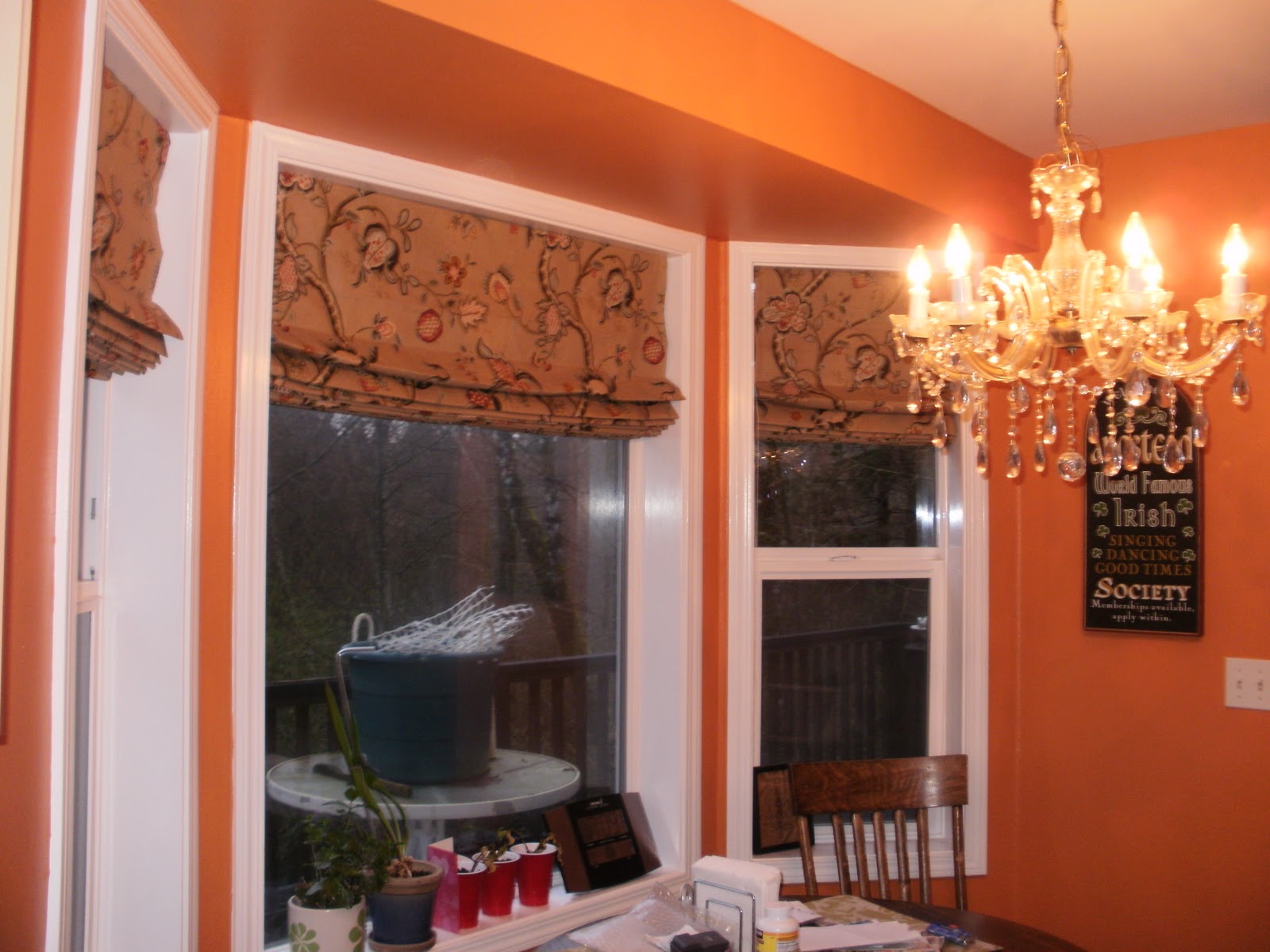
McCall's Kitchen/dining room. Chandelier has been replaced with a much more modern fixture since this photo.
Maybe you don't want to go that red with your orange choice...This dining room photo shows more of a burnt curry/pumpkin- a color my daughter(see above) and a family friend have painted in their home.  I love that they were confident enough to try it!
Photo found at Home-Interiors.com
Why not bring in pillows with this snappy color? A bedsread, tabletop accessories, or paint a wall in your home with this energetic color. Personal devices and appliances are also available in this color-if you just don't want to commit that far!


Thursday, January 5, 2012

What happens at the Aria, stays at the Aria...

 What or where is the Aria?  Vegas, of course!  And what was I doing there, besides shopping, was taking pictures and oohing and ahhing over it all.

I was lucky enough to stay at the Aria because I tagged along while my husband attended a class there.  Of course there is alot to see in Vegas in general, it is all about being bigger, more showy and  more grand than anywhere else...

The Aria Resort and Casino, Las Vegas is a AAA  five diamond rated hotel with 4004 rooms in two 51 and 61 floor towers with curved glass and steel that meet in the center.  To quote their Facebook page:  "Among the notable aspects of Aria is its incorporation of technology in the exterior and interior of the hotel, specifically for the reduction of energy consumption>  It is the largest hotel in the world to have earned LEED Gold certification.  On account of its smart rooms which automatically adjust curtains, turn off lights and electronics, and regulate temperature when a guest enters or leaves a room, Aria was described in Popular Mechanics as possibly 'the most technologically advanced hotel ever built.' "


This first picture is of a leather wallpaper hung near the elevators.  The swirls are stitched into the leather.  Very COOL!!!


This wallpaper made of leather with the colorful stitching.

 This "artwork" hangs near the spa and health club area.  It was made of solid colored silk fabric sewn onto the base in wavey style lines. 
Artwork quilted of silk


The closet are of the rooms had the center console of drawers and 2 closets, one on each side.  The closets had lights that turned on and off when opened and shut, consecutively.
Very dark wood with simple embellishment of silver running through it was a modern touch.
Closet area.

The main area of the room was equipped with an iPad type device that could control curtains, temperature, tv channels, and an alarm clock.  Bronze with embroidered aubergine motif silk bedding, the softest pillows on the planet, dark aubergine velvet pillows, headboard of the aubergine velvet against a beautiful  backdrop of wood and silver.  (P.S. the pillows and bedding were available for purchase in their retail shop.)
Bed area.

Desk, tv and fridge area was very simple, yet elegant.  Wall on right was full length glass looking outside.
Desk area.

The view out of the full-length window in our hotel room was down to this awesome canoe sculpture located in front of the Vdara Hotel and Spa. (Picture was found on Rex's Blog and Casino Guide.)  Pretty cool, huh?!?!?


 Even the ceilings in the lobby area had huge cut-outs made of dark woodIf you have a chance to stay there, it is well worth it!

I hope you have a healthy, happy New Year!  I hope to inspire you to surround yourselves with beauty!


Friday, November 18, 2011

Color undertones? ...What???

What undertones do you like?  Not underwear...but color undertones?

There are lots of different areas we could talk about with color, but today I want to talk about undertones.  Contrary to what some people think there are only 2 undertones to color: Blue and yellow.  (No, there is no red...unless you are talking about skin???)

This photo is Feras Irikat, who is the Design Director  at Oceanside and Mandala Tile.  He is standing in front of colors that show the blue undertones to the left and the yellow undertones are to the right.

First, if you tend to like a color with blue undertones what does your personality tend to be like and /or what kinds of things do you like around you?  You tend to be a list writer, like modern, shining, like quilding such as Louis VXI, like lots of pattern, like intimate, close rooms, use accent walls, nametags, you can be analytical, time conscious, and can be naggers.

On the other side, if you prefer yellow undertones in your colors, you tend to not write lists, you prefer organic things, textures, open living lifestyle(versus closed, intimate rooms), no nametags, you tend to be very friendly, not time conscious, and when you say things you only say them once and don't repeat it.

Where do you fall?  And do these generalities apply to you? 

Consider that there are visible wavelengths of color to humans with green being at 550 or the exact center as it has equal parts  blue and yellow.  This color always has a positive reaction, but it can also have blue or yellow undertone.   Blues produce melatonin in the brain, but in high levels it can produce depression.  Red is a stimulant, and pink can over-stimulate girls.

What colors on each side of the color spectrum have no undertones?  Magenta is purely blue and red, and on the yellow undertone side, orange is purely yellow and red.  Some people go as far as to carry a color swatch of the orange and magenta with them when chosing colors as each side will help you choose a harmonious color story.  If the orange goes better with your chosen color, then your undertone is on the yellow side.  If the
To find out where a color falls, and therefore what it’s undertone is, simply know 2 important facts:   There is only one color that exists on the warm side of the chart and not the cool side, Orange.
And, there is only one color that exists on the cool side and not the warm side: Magenta.


But how do I use this information?  Put a swatch of orange and magenta next to your color or a color palette and you will see quickly where your colors fall on the spectrum. Do they blend together and are your undertones consistent to result in a harmonious and perfect blend for your purpose!

All Colors are Good, All Palettes are Not
Remember there are no bad colors, but there are bad palettes. Keep the Harmony of the colors, a smooth transition on the eye between the pigment and the undertones make a beautiful palette.
magenta goes better with your chosen color then the cooler colors will harmonize best!

This room below shows both colors(or close to them) in one room...

from Tradional Home.com

A side note:  after WWII, navy blue became masculine because of the army uniforms.  Prior to this, pink was considered masculine because it was red with a some white mixed in and red is usually associated with warnings or power.  (Think red power ties.)  Very interesting!!!  In current times babies are inundated with blues for boys and pinks for girls...

Think about this, black to the blue undertone people represents an authoritative color, but to yellow undertone people it is a morbid color.

I don't know if this helps you in any way but it IS interesting to think about!

Monday, November 14, 2011

"Color is music to your eyes!"

I have always been intrigued by color, and take as many classes as possible regarding color as I can!  When I signed up for the Montana Tile and Stone Summit in Bozeman, MT in September little did I know that I would get to hear one of the most dynamic speakers ever.  His name is Feras Irikat and he is the Design Director of Oceanside Tile and Mandala Tile Companies. 

I was so excited after taking his color theory class, I have just been dying to share some of the information.  This is the  2nd blog covering it all!

Pigment and color are influenced by texture, rough or smooth, honed or polished, etc.  (Think about how a textured wall will have some shadows and the paint appears differently to show the texture.)

When considering a color, it must be looked at in it's intended environment WITH  the light source that will be used.  Remember that there are light fixtures that cast a blue or yellow (cool or warm) light, and these will affect the color used.

No 2 people will react to a color the same way!  We all see it slightly differently.  And, as we age our cornea becomes more yellow so this too affects our perception of color.  Our color perception is affected by conditioning also.  Consider that before WWI, navy blue was considered a feminine color until it was used for Army uniforms.  And pink, since it was a lighter shade of red was used for boys as it denoted power and authority.  Boy, not now!
from MinimalistHome.com
Think about why you purchase certain items: do you need it, value it, or is it an emotional purchase?  Color can affect the emotional purchase...

Condiser your clothes when deciding on a color palette because whatever colors you look good wearing you will look good sitting in.  Don't buy a yellow sofa if you don't wear it, because you will look sickly!


Remember that there are no bad color choices...meaning if you love a color it will be "in style" or appropriate for your living spaces.  Any color will look good as long as it is your taste.


Monday, October 31, 2011

DNA of color....

Of what?  COLOR...the DNA of color!  Use it to be sure your color scheme will harmonize.

After attending a class on color I got all excited and will write 3 different posts regarding this.  Think about how we perceive color...no 2 people see or react to the same color the same way!  Why, because of emotional and biological factors.  (Maybe your time-out sofa was mauve growing up and now you hate that color...almost get sick seeing it...enough of a visual?)

Before we get too far into this subject, consider harmony in color.  In order to do this, we must break down color into its "DNA form" or its most basic parts.  What colors make it up?  By that I mean, how much of the primary colors are present?  Blue, yellow and red. And, how much of each are in it- or it's undertone.  (We are not talking about whether the color is a warm or cool color here-we will save that for another time.)

Basic Color Chart
According to an article titled "Color Decoded", (published on www.kbbonline.com and written by Feras Irikat), before we get to far with the DNA of color or it's undertone we must first consider that a color can only have a blue or yellow undertone.  No red, but why not?  Our eye can recognize red as a full color, our rods and cones(inside our eyes) cannot recognize it as an undertone, therefore our eye moves to the next dominating primary DNA, blue or yellow.  If colors share alot of DNA strands they will work together harmoniously.  If they don't share these same DNA strands or undertones, will vibrate with each other.  With common DNA or undertones in the colors we are using together, the easier it is on our eyes to transition visually from color to color. 
The citrus colors and the purple are more lively here!

The article goes on to say that this does not mean you should never use "vibrating" colors, because some situations may require them.  They also quoted Michel Eugene Chevreul:  "In order to change a color, it is enough to change the color of its background." 


This room has a less jarring color scheme.


The next blog will go more in depth with color undertones and characteristics of people who prefer one undertone or the other.  Where will you fit in?

Wednesday, October 12, 2011

1983 Tri-level gets a 2011 RockyMtn Update


AFTER- ALL NEW ENTRANCE
What do ya do with a 1983 tri-level with grey vinyl siding to update it?

Actually a multi-level home meaning there are 4 levels, but from the outside it appears to be a tri-level.  Still, what do ya do with it? 

BEFORE-OLD HOUSE SIDING and
 BRICK
I am pretty sure my husband will never let me update a home again....we might as well built a new home for all of the updates it has led to...and as I have blogged before, this all started with the need for a new roof!   AND my attending Interior Design school...because then I knew what was possible...
SIDNG REMOVED to prepare for NEW ROOF


And boy, did it cost my husband...but boy does it look great!  This chronicles the changes to the exterior of the home as far as the siding, rock, etc. goes.  But, now we are contemplating the installation of a paver patio and filling in with some greenery where it got run over by contractors or died because we had no sprinklers.  (Sprinklers came at the end-I will mention them later.)
SHED ROOF ADDED above FRONT DOOR

So, because we needed a new roof, I said it would be a perfect time to add a new shed roof to the front to change the 1983 looks of the house in general.  (Believe me, vinyl siding in our hot/cold climate do not go together! Weed eaters eat them in the summer and freeze breaks it in the winter...))  So, off we go to an architect to get plans drawn up for the shed roof (that is the new overhang above the new door) and I wanted to add some columns of some sort-which he did and I truly love!

SHED ROOF, DOOR and COLUMNS during construction
So, new roof shingles meant a new shed roof needed to be constructed first, and if you are adding the new shed roof, we probly ought to change the front door as it was an oak door that the finish bubbled from the heat and had an old ugly storm door atttached. 


HUSBAND REMOVING BRICK(I hauled it to the trailer after it was down)
Do you see where this logic is going?  From there we had to decide what to do about the siding at the front door....you may not be able to tell easily from the posted pictures but there was brown brick from the ground up to the roof  across the main level and then as a wainscot on the taller side of the house.  To install the front door the brick had to come down...so we ended up siding the whole front of the house-AFTER we took the brick down and built an apron under the bay window. 
BUILDING NEW APRON UNDER BAY WINDOW

Now, if we were going to "rock" the front of the house, columns included, we need to "rock" the fireplace as well.  Again, do you see where this is going?  Yes, we built a new fireplace inside and had it rocked at the same time.  (Those pictures will appear later in an interior blog.)
FIREPLACE BEFORE
AFTER ROCK INSTALLATION
AFTER-NEW SIDING and ROCK
It took 2 years to get the siding finished, not because of contractor delays but because of the budget.  Several things, like 32 foot walls were removed inside and a sprinkler system installed, in addition to the roof, siding, rock and fireplace.  Interior changes will show up in an interior post to this blog.

I am actually taking a bookmaking class and plan to make a book of the whole remodel process and update of this home.  I will be able to use it for my business and have a record of what it looked like before, like a "look what I can do" book.


AFTER-NEW BACK DOOR AND SIDELIGHT(don't look at the deck, that is another project)
Our next stop on this remodel rollercoaster will be to show interior updates we have made so far. 

Check out my new facebook page titled: www.facebook.com/VernaVuckovich@v.v.Design
I share an interior design quote there every weekday- just to inspire you...AND if you are inspired but aren't sure where to begin with a project, give me a call.  Maybe all you need is a 2 hour consultation to get on the project started or if you need more help I can provide color renderings of the project, items to use in the project,  space planning( how much and what kinds of furniture would fit in a space), and kitchen or bath cabinet plans.

I hope the moral of this story is that you really don't have to build a new house to get a different look..yes, it may have been easier to build, but we loved the location, neighbors and square footage!  Happy dreaming!  I can help you do it!