Tuesday, January 25, 2011

More trends for 2011

More trends…for 2011…
Predictions are that we want our lives and homes to be less complicated. With the slow economy and job market less money means less stuff and not buying stuff for the sake of buying stuff. Spending is on more expensive artwork and framing that will be a long term purchase, have more meaning, last longer and even be more unique than if they were buying at a big box store. Quality pieces with great craftsmanship will be important because our money is not going as far as it used to, we want them to last.

Consumers are opting for less formality, meaning no more formal dining rooms. We are spending more time in our kitchens and family rooms. Family time is important and consumers will make room for board games, hanging out or reading. Along these lines, this also means there won’t be televisions in each room so that the family will get together to watch TV. And, furniture needs to serve more than one purpose…modular furniture that can be repositioned, or coffee tables that store, or a side board that doubles as a TV stand.
Another trend is towards blending old with new: bold patterns, bright colors, or ethnic prints on traditional furniture pieces. Turquoise or mint green on a Bombay chest are an example. Consumers are getting more confident to mix it up. On the other end of the spectrum is pastels, neutrals, very calm color schemes. It shows a mix of their choice of styles and self-expression. These chests are from http://www.homedecorators.com/, but why not paint an old commode or chest you have around your house for alot less money?
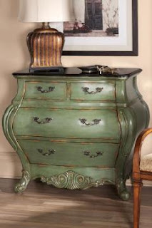


We will not see much new in the design world until the real estate market turns around. In the mean time consumers may opt for brighter, bolder accessories that can liven up a neutral couch or décor. And, they may opt to change the accessories with the seasons.

Now that you know the current trends, are there any you want to incorporate into your decor? Any you have already implemented? (In that case you can pat yourself on the back-you are ahead of the times!!!)
Inspiration of the week: Amaryllis bulbs…My green thumbed mother bought some amaryllis bulbs after Christmas, planted them and now, the end of January I have a beautiful, multi-flowering plant. Very fun!!! I have never seen anything like this bulb, it is very exciting. I have nurtured amaryllis before and have had success for several years. Then this year, we had some events that kept me away from home more than usual and I forgot about my bulbs that I had so carefully forced into dormancy in the basement. I really don’t think I will be able to salvage those old ones, so it was an awesome surprise to get one of my moms.


Design Quote of the Week: “Make your home as comfortable and attractive as possible and then get on with living. There’s more to life than decorating. " - Albert Hadley

Remodeling update: I finally found fabric for the bay window shades. It is a Lafayette fabric named Quadrate. It is 100% polyester (I would rather have a natural material- but it will not fade in the full sun) with slight sheen and linen look. I love that it has a contemporary look with the tradition of linen. Other fabric from Lafayette can be seen online at www.lafvb.com

Monday, January 17, 2011

2011 Trends

It’s that time of year again..trends! What are the predictions?
Do you follow trends? Or do you follow your trends/signature style? As a designer I try to steer my clients toward what they are most comfortable with. Why go modern or contemporary if they love the warmth & coziness of the French Country or Traditional styles? I also think styles can be combined- for instance my own home is a mix of styles. What I call Montana Rustic, contemporary, French country, and traditional. I guess it could be termed Eclectic. I would be more contemporary if I didn’t live in Montana and have a few antiques that I just can’t bear to live without!

Back to trends...the predictions for this year are influenced by current social and economic happenings. A resurgence in people being interested in their ancestry which means more influence from patterns, textures and colors with a global influence. Ikat fabric designs are very popular, see Calico Corners website for fabric choices. This one is from the model Iman's collection.

Tied into this is the green movement. We will try to save the planet by reusing items over and over. (Can you say “recycle, redo, remodel?”) Reupholstering a couch or chair with a bright bold fabric can update the couch and prevent it from going into the landfill. I have a 1930-1940’s camelback couch and club chair that have been reupholstered twice and three times respectively in 15 years. (The first time I used an off-white brocade, then got 2 boxer dogs. Boxers and off-white couches don’t go very well together.)

The use of Grandma’s antiques or reusing bedroom furniture in the great room are examples. At my house, a nightstand could be painted a brighter color and used as an end table or an antique East Lake commode that is currently being used as a console style table, and will finally be reused as a bathroom vanity by adding a vessel sink with granite on top.
I realize I have used the above pictures before- they apply again to what I am discussing.

Social and economic happenings are also affecting how we are decorating our homes. It appears that the stresses of a slumping economy with houses not selling, and jobs going by the wayside have helped us decide to have homes that are comfortable, not ostentatious. We want comfort and what is familiar in the uncertain times. They are predicting our purchases will be more meaningful, keeping what we love and not necessarily buying the newest styles. You really don’t need to buy new when you are redesigning a room or area of your home.
** If you are looking to have a more modern look, why not buy a 1960 or 1970’s era couch from a garage or estate sale and refresh it with a new slipcover. (Be sure there are no smells attached- and you can find instructions online as to how to slipcover. Although it is not an easy job, it is very do-able if you own some pins and a sewing machine.) A coat rack made from older doorknobs... artwork using an old ceiling tile...an old metal cabinet used as an end table... "shabby chic" is a design style that encourages reuse and even unfinished-looking items.


Next week I will discuss more trends. There is a lot to discuss!!!

INSPIRATION OF THE WEEK: Linen fabric for my bay window shades had me thinking about…linen look tile. Very fresh, very fun and very traditional. Check out Ann Sacks Tile online.


Design Quote of the Week:
“Even if I love it, I don’t put everything on display. I am always ruthlessly editing.”—Madeline Weinrib, December 08 issue of Elle Décor Magazine

Remodel update: Nothing new to report…I am awaiting spruce planks to make a 6’ round table top. The planks are in a kiln drying to about 6% before I will get them. The base is still undecided…more on that later.

Thursday, January 6, 2011

Honeysuckle # 18-2120

HoneysuckleThe holiday season is over…decorations are put away…now what? How about a color change in the house or cabin? Honeysuckle is Pantone’s Color of the year and why… drum roll please…


According to Pantone it is a “color for all seasons. Courageous Confident Vital A brave new world. Let the bold spirit of Honeysuckle infuse you, lift you, and carry you through the year. It’s a color for every day- with nothing ‘everyday’ about it.”

What are they talking about? I guess it is the psychology of color. While last year’s Pantone Color of the Year Turquoise # 15-5519 let us escape and think of relaxation and the tropics, honeysuckle will lift our spirits in times of stress. This reddish pink color attracts the hummingbird to its flower and looks good on men and women. According to Leatrice Eiseman, Executive Director of Pantone Institute, it is also believed to help us get rid of the blues and bring on a nostalgic feeling because we associate the color with its scent and carefree days of spring and summer.

How can you use it without being overwhelmed? How about in your accessories or paint an accent wall in a hallway, kitchen or family room. Crate and Barrel has some beautiful pillows, shower curtains and bedding in this color. They are sure to lift your spirits on a cold winter day! It has also been combined with a kelly green or a spring green for a rather "preppy" look-at least it reminds me of some of the clothing that J.Crew offers that definitely have a "preppy" feel to them.

Crate and Barrel Bedding

Crate and Barrel Shower curtain


Holiday Kitchen fromTraditional Home

Design Quote of the week: “I don’t think people have enough fun with decorating. It doesn’t always have to be so serious. Design isn’t like a marriage. You don’t have to commit for life.” -Designer Ross Cassidy, June 2010 issue of Elle Décor magazine

Inspiration of the Week: I ordered fresh cut spruce for a 6’ round table top I had viewed on a website that offered recycled wood accessories such as benches and tables. I wanted a rough look to my tabletop and may beat the wood up with a chain or hammer before I put a finish on it. I also made sure it was 1 ¾” thick for a nice deep edge and plan on “biscuit-ing” it together and building a frame for the underside to prevent twisting. The guys at Windsor Plywood have been most helpful!

Remodel update: Right before the holidays I finished the trim paint( which by the way, I think my door color- Suitable Brown-was used on the railings in the MT State Capitol Building), looked at a lot of fabrics for roman shades for the fishbowl of a dining area and finally decided to buy natural woven wood blinds from my own company. I sell blinds from Timber Blinds, check it out at http://www.timberblinds.com/, then let me know if you are interested or need a consultation about window coverings.