Wednesday, April 6, 2011

Saturday, April 2, 2011
Thinking about change/CMG color forecast
I have been thinking about changing the content and the things I write about on the blog... I will update - or just actually change it all up on you without notice!!! I will still be discussing interior design, but the entries may be shorter and more frequent! Keep reading and become a "follower"...it is quick and easy to do...and you can comment on anything you see in the blog or request a subject you want more information about. The last couple of years I have been providing the color of the year from Pantone. There is another group of professionals who predict color trends, etc. for alot of different industries and it is called the Color Marketing Group. Honey Moon. A” golden honey color with a hint of ochre”.  This is the Color Marketing Group’s forecast from their fall meeting. Their spokesperson says “It is a vintage color that goes well with citron, dark leafy greens, spice market reds, and dusky violets”, creams and metallics. CMG is a group of design and color professionals that look for the top palette pick for the “next” color to use. It is a long way from the bright pinkish color that Pantone chose, honeysuckle, for its color of 2011, but just as beautiful. I love this color, it can really brighten up a room. Pre-remodel, my formal living room used all of these colors and they work beautifully if you like a French Country look. In a south facing room, such as mine, it was such a sunny color perfect for taking a nap in or reading a book. Even at night it would perk you up. If you want to know more about CMG, go to: http://www.colormarketing.org/Visitors This picture from the Calico Corners website shows a more modern mix of patterns and the honey moon color.
  Design quote of the day: While I like the things that I own, I don't have anything that I could not live without. I am constantly moving things around, passing them on to friends - a sort of sharing- and when it is appropriate, using things I own in decorating schemes. When I use something that I have owned for many years in a project for a client, I don't think of it as getting rid of something. For me, it is like keeping things in the family. Albert Hadley, The Story of America's Preeminent Interior Designer Remodel update: Finally took pictures of the roman shades I made. It uses a linen-look poly fabric that has a small square motif in perfect little rows horizontally and vertically. They have eliminated the "fishbowl" where any passerby could see into our lives.
  Inspiration of the day, week, or month: the Home Show inspired me to get going with my kitchen drawings, quotes and materials. I basically have them picked out, just need to know the cost. More to come on this issue...
 This is the Color Marketing Group’s forecast from their fall meeting. Their spokesperson says “It is a vintage color that goes well with citron, dark leafy greens, spice market reds, and dusky violets”, creams and metallics. CMG is a group of design and color professionals that look for the top palette pick for the “next” color to use. It is a long way from the bright pinkish color that Pantone chose, honeysuckle, for its color of 2011, but just as beautiful. I love this color, it can really brighten up a room. Pre-remodel, my formal living room used all of these colors and they work beautifully if you like a French Country look. In a south facing room, such as mine, it was such a sunny color perfect for taking a nap in or reading a book. Even at night it would perk you up. If you want to know more about CMG, go to: http://www.colormarketing.org/Visitors This picture from the Calico Corners website shows a more modern mix of patterns and the honey moon color.
  Design quote of the day: While I like the things that I own, I don't have anything that I could not live without. I am constantly moving things around, passing them on to friends - a sort of sharing- and when it is appropriate, using things I own in decorating schemes. When I use something that I have owned for many years in a project for a client, I don't think of it as getting rid of something. For me, it is like keeping things in the family. Albert Hadley, The Story of America's Preeminent Interior Designer Remodel update: Finally took pictures of the roman shades I made. It uses a linen-look poly fabric that has a small square motif in perfect little rows horizontally and vertically. They have eliminated the "fishbowl" where any passerby could see into our lives.
 Inspiration of the day, week, or month: the Home Show inspired me to get going with my kitchen drawings, quotes and materials. I basically have them picked out, just need to know the cost. More to come on this issue...
Monday, February 28, 2011
Why can't I paint these...?
Why can't this picture be painted by me?



Remodel update: I am currently working on roman shades for the large bay window in the great room. I will post pictures as I get them completed.

It appears that a grade schooler could paint this picture...somewhat of an abstract with primary colors...so I was bored one day and decided to try to paint something for my laundry room wall. I do not have any formal training as to how to paint just experience from a "color" class where we mixed paints to get tints and shades, but I do have a father who has painted beautiful oils of wildlife. (Maybe some of it rubbed off on me by osmosis or something... as I have not lived with him since I was 4 or so.)
I will never be as good of painter as my dad, but I can produce pictures that I like to have up on the walls. First you must buy the canvas from a craft store and some acrylic paints in your color choices. Keep in mind that you don't have to buy every shade of pink or green that you want because you can change the store bought colors by adding black, white or cream. You may also need to buy a couple of paintbrushes- it does not matter if they are from the hardware store or the craft store, just decide on the sizes needed. The size of your canvas and what areas you are going to paint will help you decide this. A metal pie pan or a styrofoam picnic plate can be used as your paint tray. I keep a stack of paper towels or napkins around to dry out the brushes when changing colors.
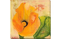
I also used vinyl wall art to make a stencil for this picture(below), I painted the background colors first, layering them, drybrushing some of it and using a "blending" agent for others. I then applied the vinyl stickers represented by the plants/flower pieces. If I grow tired of these plants/flower features I can peel them off and add paint or another design to the top.

The painting below I used vinyl wall stickers of a damask design as a stencil. First, I painted the background, blending just one color(green) and drybrushing other greens to create the blended look. Let it dry. Second, I added the vinyl stickers, then painted the fuschia/mango/golds. I peeled the stickers off to reveal the background color.

The third example is definitely the most basic. Paint the background, using fuschia, melon, and golds (and all combinations in between). I then penciled the plant figures onto the canvas and preceded to paintover the pencil marks.


Easy projects that can be done in a day or two...give it a try! I look for inspiration from websites such as http://www.allposter.com/ and http://www.art.com/ . I admire the artists who painted these works and look to them just for inspiration.
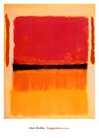
The images below might be a good inspiration for a painting as they are also abstract and may not require any significant drawing skills.


Remodel update: I am currently working on roman shades for the large bay window in the great room. I will post pictures as I get them completed.
Design quote of the day: "Rooms should be timeless." by Sister Parish
Inspiration: I think I just covered that....above...
Inspiration: I think I just covered that....above...
Monday, February 21, 2011
Color schemes cont...
More color schemes? Yes, I can never get enough..in fact I love pouring over colors for a room or house I am working on...you can definitely change the atmosphere just by changing the color. I think back 17 years ago when we bought our house and the carpet was peach, the walls were freshly painted off-white(because they were covering peach paint!), and the kitchen had dirt colored carpet, not sure if it came that way, but when we changed the flooring there were buckets of dirt underneath...like who was the cleaner there??? (Keep the peach in mind when reading below-because 1 of my favorite sayings is: "What goes around, comes around.") My great room has come a long way from peach, then to a golden color, and now the new tabacco leaf, garden shed, and morning sky paint on the main floor walls.
When changing your interior decor it is a good idea to coordinate old with new. I just finished painting my oak bannister(I know some of you wood lovers will be appalled) to match the new door color(Sherwin Williams suitable brown), re-stained the endcaps and shoerail to match the new laminate floors. I left the ballusters an off-white that matches the trims around the room.
To get started I recommend looking at the paint store pamphlets for ideas. Then take color swatches home and tape them to the wall as the lighting in the stores are quite different than in your home. If need be, buy a sample and paint a square of the paint on your wall or a piece of wood. Then let the sample sit throughout the day so you can make sure you like it in all of the different lighting it will be exposed to. (i.e. flourescent lighting, sunlight, incandescent, etc.) The paints that seem to change color before your eyes tend to be the taupes, tans and lighter colors. They may be picking up on the color of an object placed close by. For instance, the tobacco leaf has a green tinge in my house most of the day, but looks tan at times because of the lighting.
I have included several color schemes from the 2011 Benjamin Moore brochure. For a modern mediterranean look, try Benjamin Moore's Intense Peach on walls or an accent wall, with Porter Ranch Cream(ceiling), Raisin(trim),Jaimacan Aqua (pillows or small upholstery), and Natural Wicker(large pieces.)


For a spirited, vibrant, colorful, bold, playful look, try Benjamin Moore's Storm, lucerne, royal flush, paper mache, wrought iron, and grape green.


A "soulful" look would include Benjamin Moore's hush, vintage wine, etrscan, wasabi, and amulet.


Remodel update: I think I told you last posting that I had painted the bannister the new door color, and re-stained the endcaps for the stairrail going to the top floor. The bannister and endcaps were stained a light oak that matched the kitchen cabinets, so I went alot darker to match the new floor. We are having a debate about whether to carpet the steps again or use wood. I, of course want wood or painted steps, my husband wants carpeted because he is afraid he or the dogs will slide. The picture on the left is BEFORE; the picture on the right is AFTER. (In the AFTER picture, the door to the right is one of the new doors with the Sherwin Williams Suitable Brown.)


Design quote of the day: "It is just as disastrous to have the wrong accessories in your room as it is to wear sport shoes with an evening dress." Dorothy Draper
Inspiration of the day: I don't have one today...just internet shopping for a table base I could use. Any ideas??? I like an urn style pedestal for a 6 foot round top...let me know if you have come across anything like this!
Tuesday, February 8, 2011
Color schemes...
Even though I have chosen colors for my own remodel, I have noticed quite a few articles in recent magazines regarding color schemes. My last couple of posts dealt with current trends in interior design along with some color predictions. There is just too much information about color to present it in 1 post- in fact there are people who specialize in"color". They will help choose color for personal clothing selections or interior/exterior paint to help us achieve whatever it is that is we want to achieve and for whatever functions in that space.


I guess I tell clients that they need to choose colors that they like, not what is popular at the time. I do steer them to colors that fit their personalities and will enhance the intended use of the space. If a room is a bedroom, bright bold colors may not be the best choice if sleeping is the intended function. Colors such as bright red or kelly green can be stimulating and not restful or calming.
When choosing colors consider if the client is going to sell or move in the near future. If you watch HGTV at all, they have shown that neutral colors sell better than bright colors. Personal favorites may not appeal to all potential buyers. And, buyers may not want to paint right away after they move in. Gray or yellow used to be the colors that sold best on the exterior of a house. Interior colors that sell best are neutrals such as tan, greys or even light greens. Consider the color pallette found below from Benjmin Moore paints. The colors are, listed from left to right, Genesis White 2134-70, Etiquette AF-50, Gray Mirage 2142-50, Kendall Charcoal HC-166, Porcelain 2113-60, and Smoke 2122-40. (Gray mirage is actually a grey sage color, but as we all know that print colors are definately different from screen colors and.) You really should locate actual paint samples for any of these as they are quite beautiful.


Another thought to keep in mind is that a color palette should blend from room to room or have a "story". That does not mean that all walls have to be the same color, just maybe an accent in 1 room is the main color in another. It also means that the mood should be the same from room to room. It is not as pleasing to the eye if you have several bold bright rooms with others being soft(pastel or grayed) colors. Now variations of 1 color from room to room can be a color story of its own. If your home is smaller, carrying similar colors throughout can make the home seem larger or more spacious.
I have included some color pallets that have shown up in magazine articles and color cards at the paint stores. It seems they are either calming or bright...remember the color of the year? Honeysuckle? Well, it or other shades of pink or melon are appearing more frequently on the printed page. I am just not sure that I can live with pink and green room...way too preppy! But, they certainly are lively, happy and make me think of spring! Montana has had an awful long winter so far....and it is only February. If you are liking a brighter color choose more soothing colors to go along with it or just make the bright color an accent in a bookcase or 1 wall. The paints below are Martha Stewart Light Sandstone, Martha Stewart Mink's Cloth, and Benjamin Moore Kingsport Gray. The light sandstone was used in a bookcase niche to create a focal point and the tan/browns can be used to tone the overall look more casual.


Food for thought....According to Newell Turner, Editor in Chief of House Beautiful, before the 1940's pink was used for boys and blue was used for girls...now that's quite a switch...he and I do not know when they swapped.
Personally, I have used brights and subdued colors in my spaces over the years and find myself entertained by television shows where the hosts use outrageous colors and accessories. I like to see them used but have no desire to live with them in my own home. Lately the HGTV show "Candice Tells All" designed a room with an Indian inspiration. Very bright colors, bold patterns in drapery, paint, accessories, but tile, sofa and flooring were not so bright. Color Splash Miami always uses bright, splashy colors(hence the name) but it is tastefully done and much more expected in Miami where the show is taped. Montanans tend not to use such bright colors. (Unless you're a teenager...they tend to pick black or a brights as they are more stimulating...which may make it harder to sleep as I stated earlier...)
I do tell clients that if they want to experiment with a bold color, buy a sample of it first, or just use the bold colors in accessories as then you are not married to it as time goes on. (Paint is alot cheaper to replace than a sofa!) Neutral sofas or pieces of wood furniture are much easier to live with for a longer period of time. And, you can buy slipcovers or paint a piece if you are looking for something brighter.
Ispiration of the week: I was at a local flooring store/design center where they had samples of window coverings. They had recently put up new displays with a edging attached at the sides, and that made me think about putting an edge on my bay window shades. I found a natural linen that will just set off the main fabric and provide some classic design for the shades.
Design quote of the week: Pink is the most flattering color of all, especially at night, with candlelight. Everyone looks glowing. I think of it as a neutral-it works with any color scheme." - Frank De Biasi in House Beautiful March, 2011
Remodel update: Nothing new to report, I will be looking for bids on new kitchen cabinets. We are planning to finish the exterior siding before we replace the cabinets but need some pricing to planfor it! If you have driven by my house you will notice the gray cement board siding on the front, but grey vinyl siding on the other 3 sides. Not pretty, but we have decided to remodel as we can afford it.
Tuesday, January 25, 2011
More trends for 2011
More trends…for 2011…

We will not see much new in the design world until the real estate market turns around. In the mean time consumers may opt for brighter, bolder accessories that can liven up a neutral couch or décor. And, they may opt to change the accessories with the seasons.


Predictions are that we want our lives and homes to be less complicated. With the slow economy and job market less money means less stuff and not buying stuff for the sake of buying stuff. Spending is on more expensive artwork and framing that will be a long term purchase, have more meaning, last longer and even be more unique than if they were buying at a big box store. Quality pieces with great craftsmanship will be important because our money is not going as far as it used to, we want them to last.
Consumers are opting for less formality, meaning no more formal dining rooms. We are spending more time in our kitchens and family rooms. Family time is important and consumers will make room for board games, hanging out or reading. Along these lines, this also means there won’t be televisions in each room so that the family will get together to watch TV. And, furniture needs to serve more than one purpose…modular furniture that can be repositioned, or coffee tables that store, or a side board that doubles as a TV stand.
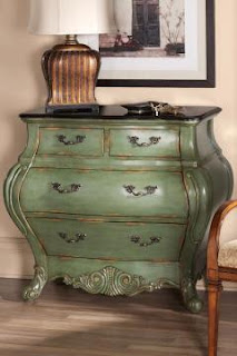
Another trend is towards blending old with new: bold patterns, bright colors, or ethnic prints on traditional furniture pieces. Turquoise or mint green on a Bombay chest are an example. Consumers are getting more confident to mix it up. On the other end of the spectrum is pastels, neutrals, very calm color schemes. It shows a mix of their choice of styles and self-expression. These chests are from http://www.homedecorators.com/, but why not paint an old commode or chest you have around your house for alot less money?


We will not see much new in the design world until the real estate market turns around. In the mean time consumers may opt for brighter, bolder accessories that can liven up a neutral couch or décor. And, they may opt to change the accessories with the seasons.
Now that you know the current trends, are there any you want to incorporate into your decor? Any you have already implemented? (In that case you can pat yourself on the back-you are ahead of the times!!!)
Inspiration of the week: Amaryllis bulbs…My green thumbed mother bought some amaryllis bulbs after Christmas, planted them and now, the end of January I have a beautiful, multi-flowering plant. Very fun!!! I have never seen anything like this bulb, it is very exciting. I have nurtured amaryllis before and have had success for several years. Then this year, we had some events that kept me away from home more than usual and I forgot about my bulbs that I had so carefully forced into dormancy in the basement. I really don’t think I will be able to salvage those old ones, so it was an awesome surprise to get one of my moms.

Design Quote of the Week: “Make your home as comfortable and attractive as possible and then get on with living. There’s more to life than decorating. " - Albert Hadley
Remodeling update: I finally found fabric for the bay window shades. It is a Lafayette fabric named Quadrate. It is 100% polyester (I would rather have a natural material- but it will not fade in the full sun) with slight sheen and linen look. I love that it has a contemporary look with the tradition of linen. Other fabric from Lafayette can be seen online at www.lafvb.com

Monday, January 17, 2011
2011 Trends
It’s that time of year again..trends! What are the predictions?
Do you follow trends? Or do you follow your trends/signature style? As a designer I try to steer my clients toward what they are most comfortable with. Why go modern or contemporary if they love the warmth & coziness of the French Country or Traditional styles? I also think styles can be combined- for instance my own home is a mix of styles. What I call Montana Rustic, contemporary, French country, and traditional. I guess it could be termed Eclectic. I would be more contemporary if I didn’t live in Montana and have a few antiques that I just can’t bear to live without!


Remodel update: Nothing new to report…I am awaiting spruce planks to make a 6’ round table top. The planks are in a kiln drying to about 6% before I will get them. The base is still undecided…more on that later.
Do you follow trends? Or do you follow your trends/signature style? As a designer I try to steer my clients toward what they are most comfortable with. Why go modern or contemporary if they love the warmth & coziness of the French Country or Traditional styles? I also think styles can be combined- for instance my own home is a mix of styles. What I call Montana Rustic, contemporary, French country, and traditional. I guess it could be termed Eclectic. I would be more contemporary if I didn’t live in Montana and have a few antiques that I just can’t bear to live without!
Back to trends...the predictions for this year are influenced by current social and economic happenings. A resurgence in people being interested in their ancestry which means more influence from patterns, textures and colors with a global influence. Ikat fabric designs are very popular, see Calico Corners website for fabric choices. This one is from the model Iman's collection.


Tied into this is the green movement. We will try to save the planet by reusing items over and over. (Can you say “recycle, redo, remodel?”) Reupholstering a couch or chair with a bright bold fabric can update the couch and prevent it from going into the landfill. I have a 1930-1940’s camelback couch and club chair that have been reupholstered twice and three times respectively in 15 years. (The first time I used an off-white brocade, then got 2 boxer dogs. Boxers and off-white couches don’t go very well together.)
The use of Grandma’s antiques or reusing bedroom furniture in the great room are examples. At my house, a nightstand could be painted a brighter color and used as an end table or an antique East Lake commode that is currently being used as a console style table, and will finally be reused as a bathroom vanity by adding a vessel sink with granite on top.

I realize I have used the above pictures before- they apply again to what I am discussing.
Social and economic happenings are also affecting how we are decorating our homes. It appears that the stresses of a slumping economy with houses not selling, and jobs going by the wayside have helped us decide to have homes that are comfortable, not ostentatious. We want comfort and what is familiar in the uncertain times. They are predicting our purchases will be more meaningful, keeping what we love and not necessarily buying the newest styles. You really don’t need to buy new when you are redesigning a room or area of your home.
** If you are looking to have a more modern look, why not buy a 1960 or 1970’s era couch from a garage or estate sale and refresh it with a new slipcover. (Be sure there are no smells attached- and you can find instructions online as to how to slipcover. Although it is not an easy job, it is very do-able if you own some pins and a sewing machine.) A coat rack made from older doorknobs... artwork using an old ceiling tile...an old metal cabinet used as an end table... "shabby chic" is a design style that encourages reuse and even unfinished-looking items.


Next week I will discuss more trends. There is a lot to discuss!!!
INSPIRATION OF THE WEEK: Linen fabric for my bay window shades had me thinking about…linen look tile. Very fresh, very fun and very traditional. Check out Ann Sacks Tile online.
Design Quote of the Week:
“Even if I love it, I don’t put everything on display. I am always ruthlessly editing.”—Madeline Weinrib, December 08 issue of Elle Décor Magazine
Design Quote of the Week:
“Even if I love it, I don’t put everything on display. I am always ruthlessly editing.”—Madeline Weinrib, December 08 issue of Elle Décor Magazine
Remodel update: Nothing new to report…I am awaiting spruce planks to make a 6’ round table top. The planks are in a kiln drying to about 6% before I will get them. The base is still undecided…more on that later.
Subscribe to:
Posts (Atom)